Responsive, Accessible, Search-friendly: How We Built a Better Festival Site
Wes Reimer
TAGS

Wes Reimer
TAGS
Note: the site discussed here changes a few times a year, so it may not reflect the images in this article.
Sometimes an organization needs help to finish or turn a project around quickly. They may have most of the pieces in place, but just need some extra expertise to take things to the next level.
That’s what happened with the Fest2Fall Music Festival – an annual event in Cambridge, Ontario. They had a simple, one-page Wix website, but there were several issues:


Fest2Fall’s graphic designer, Brandon, had created a fantastic look for the site, the poster, and all the social media requirements. But he needed some outside expertise to turn this concept into a fully responsive and effective website – to sell as many tickets as possible!
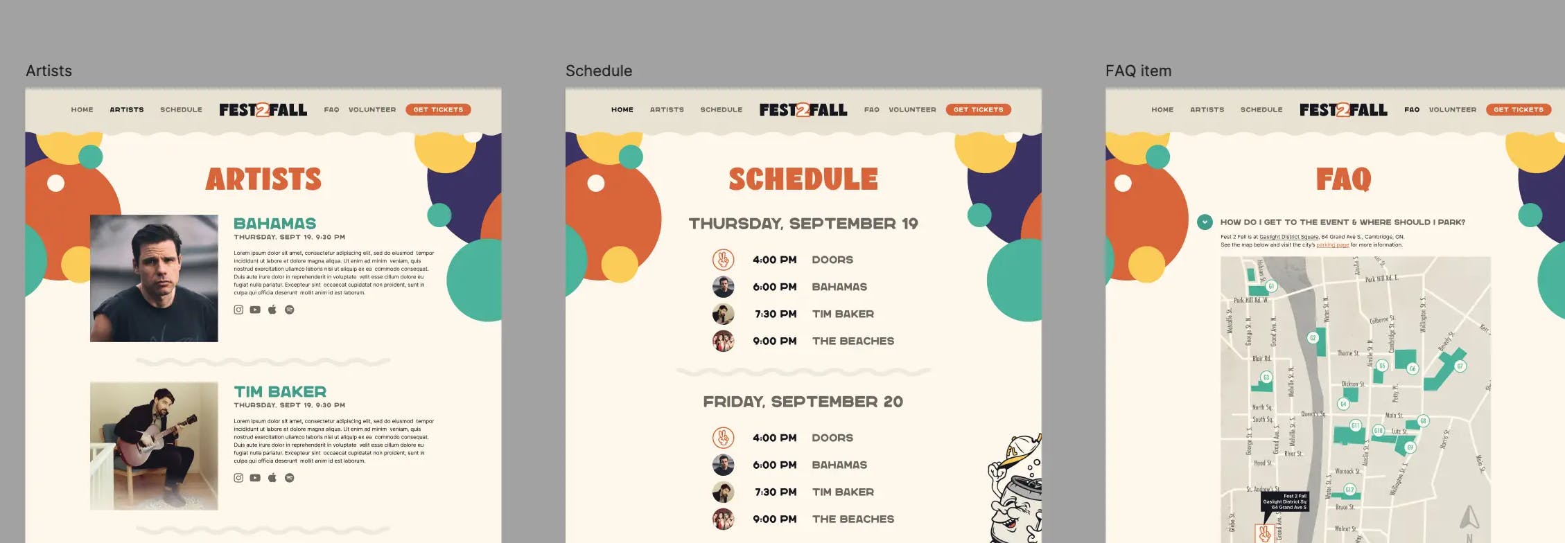
With all the assets loaded into Figma, it was easy to start brainstorming ideas for how to flesh out the design and split the content into separate pages. The websites of other music festivals provided further inspiration.

Motifs from the existing design were employed throughout the site – specifically the wavy line and coloured circles. The wavy line was used as a border or separator wherever one was needed – the header, footer and between sections of content.

The circles were used as additional navigation or call-to-action buttons – with the appearance of fun bubbles in the middle of the home page.

To address text in images, web versions of the two main display fonts were used wherever feasible. To save time, some of the text was kept as images – text that had a more challenging layout – but was split up into smaller SVG’s with the appropriate <title> (alt) text added to each one for SEO and accessibility. This also allowed discrete links to be added – to the sponsors from the text chunks, and to the Artists page from the separate images.

How the original, single image was broken up into separate text and images.
To further improve accessibility, heading tags were used where appropriate. Take a look at the page’s accessibility “tree” in Firefox’s dev tools – this is how the page “appears” to screen readers for people who are visually impaired (always best to test with actual screen readers, like Apple's VoiceOver, in various browsers):

Finally, to add some movement and professionalism, a short, looping video was embedded into the “hero” section at the top of the home page. The bubbles and cartoon beer can were also animated.

We ended up creating six separate pages to flesh out the content that was originally on one page. Comparing the two websites, they look and feel the same. Brandon’s design set the tone, but we made space for more details by splitting up the content, and applied best practices for performance, accessibility and SEO. We made Brandon look like a rock star, because he was: we couldn't have built this beautiful site without him, but he couldn't get it this far without us.

The original single-page site on the left, and separated six pages on the right.